
Order Status
Notifications

UX Writing
Project overview
I was assigned to write the new order status notifications for the fast delivery app of Getir.
The copies of the new order status push notifications were requested in both Turkish and English.
Challenges and constraints
The challenge for this project was to write push notification copies in a short format while maintaining the Voice and Tone principles of the brand.
Because the text was for the new push notifications, I can say that the main constraint was the character limitation.
The process
Getir has adopted a friendly but respectful tone for places where the user needs to be notified. The tone needs to be sincere, without annoying anyone who might be using the app.
So to find the best approach, the first step was to write different copy alternatives for each requested status.

After the first draft was ready, we reviewed the copy alternatives to eliminate any copy that wouldn't be appropriate for the push notification.
The main factor that allowed us to choose between the copy alternatives was the length of the text. As it was a push notification copy, we tried to keep it as short as possible while including the necessary information and Voice & Tone elements.

For the final step, we analyzed the tone of the copies. We wanted the message to be confident and assure the user that their order would be delivered as fast as possible.
So to reflect the brands' confidence, energy, and sincerity, we decided that the final copy should be:
"Your order is in the queue. We'll be there in no time!".
No long sentences, simple and clean.

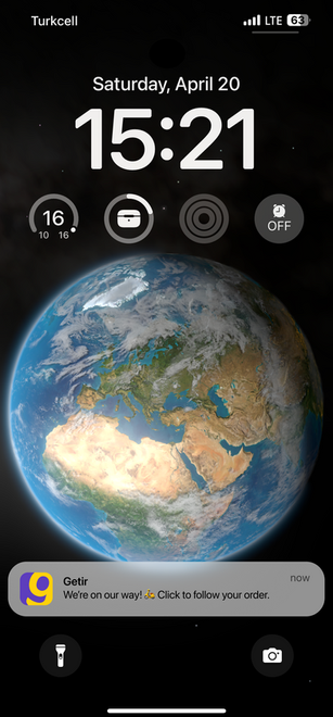
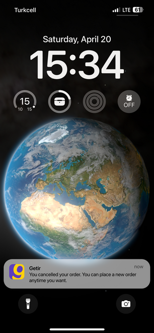
Screens from the project
Order in queue

Order being prepared

Order on the way
Order almost delivered
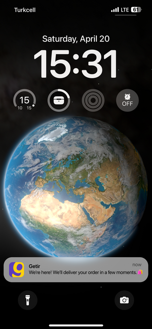
Order delivered

Order cancelled
Key takeaways
I really liked working on this project, as it was very detailed. Due to the character limitation, every word needed to be selected carefully to represent the brand in the push notification.
This project reminded me how each word mattered and just changing a single word or punctuation could determine the tone of the text written.